20 August 2026
Wine Box Branding: Print, Foil and Embossing Options
Wine box branding starts with the facing paper, not the logo. The paper decides how ink sits, how foil sticks and whether embossing holds. Choose it first. Then pick offset printing, hot foil, embossing, spot UV or matt lamination. Each has a failure mode. Dark solids, textured paper and thin facing stock cause most rejects. We'll walk through the decisions in the order you actually make them.
Facing Paper Comes First
You pick the facing paper before you talk about print or foil. The paper is the surface. It sets the ceiling for what your branding can do. A heavily textured paper will not hold fine foil lines. A dark solid will show every roller mark if the paper is too light. We keep facing paper at 157 g minimum, specialty or coated. That is the floor, not the target. For a wine box that gets handled, picked up, put down, you want a paper that does not bruise at the corners.
Six materials cover most wine boxes. Greyboard with specialty paper is the workhorse. Kraft gives a natural, uncoated look but drinks ink. White card is clean and predictable. Gold and silver cardboard are actually paper with a metallic finish, not foil. Flocked paper feels like suede but is unforgiving with foil. Leather-textured paper looks like leather, costs less, and embosses well if the grain is not too deep. You can see these in our materials and structures overview.
Offset Printing on the Facing Paper
Offset is the default for custom printed wine boxes. It gives you Pantone matching, smooth gradients and fine text. We print on the facing paper before it is wrapped onto the greyboard. That matters. You are not printing on a rigid box. You are printing on a flat sheet, then forming it. So your artwork has to account for wrap, fold and corner loss.
The failure mode with offset is dark solids. Black, deep blue, burgundy. These colours show roller marks, mottling and density shifts. We hold them with Pantone matching, first-article approval and mid-run sampling. But they are the hardest colours to keep consistent across a run. If your brand colour is one of those three, budget for an extra proof round. Do not approve a digital proof and expect the offset run to match it exactly. Ink on paper is not pixels on a screen.
Hot Foil Stamping: Where It Works, Where It Fails
Hot foil stamping puts a metallic or pigment foil onto the box with heat and pressure. It is the classic choice for a foil stamped wine box. Gold and silver are common, but you can get matte, holographic and colour foils too. The catch: foil needs a smooth surface. On heavily textured paper, the foil only hits the high points. You get a broken, flaky line. On flocked paper, forget it. The pile absorbs the pressure and the foil does not transfer cleanly.
If you want foil on a textured paper, we will tell you to switch to a smoother specialty paper or use a debossed panel. A debossed panel gives the foil a flat, recessed area to sit in. That is the workaround we use most. Foil also adds cost and a second pass. You are paying for the die, the foil and the machine time. For short runs, it can be more than the box itself. But for a premium wine gift box, it is often the difference between a box that gets kept and one that gets recycled.
Embossing and Debossing: Depth Without Ink
Embossing raises your logo or pattern. Debossing presses it in. Both are done with a metal die. On a rigid wine box, the die presses the wrapped board before the box is formed. The failure mode is thin facing paper. If the paper is under 157 g, embossing can split or collapse. The greyboard underneath is 1200 g minimum, 1400 g recommended for spirits, so the board itself is fine. It is the paper that fails.
Debossing is safer than embossing on a wrapped box. It presses the paper into the board, so there is less tension on the paper surface. Embossing pushes the paper up, which means the paper has to stretch. Some papers stretch, some crack. We test with a blank sample before you commit to a printed run. Ask for both a blank sample and a printed sample. The blank sample shows the structure and the emboss depth. The printed sample shows colour and registration. You need both. We cover this in custom wine box manufacturing.
Spot UV and Matt Lamination: Contrast and Protection
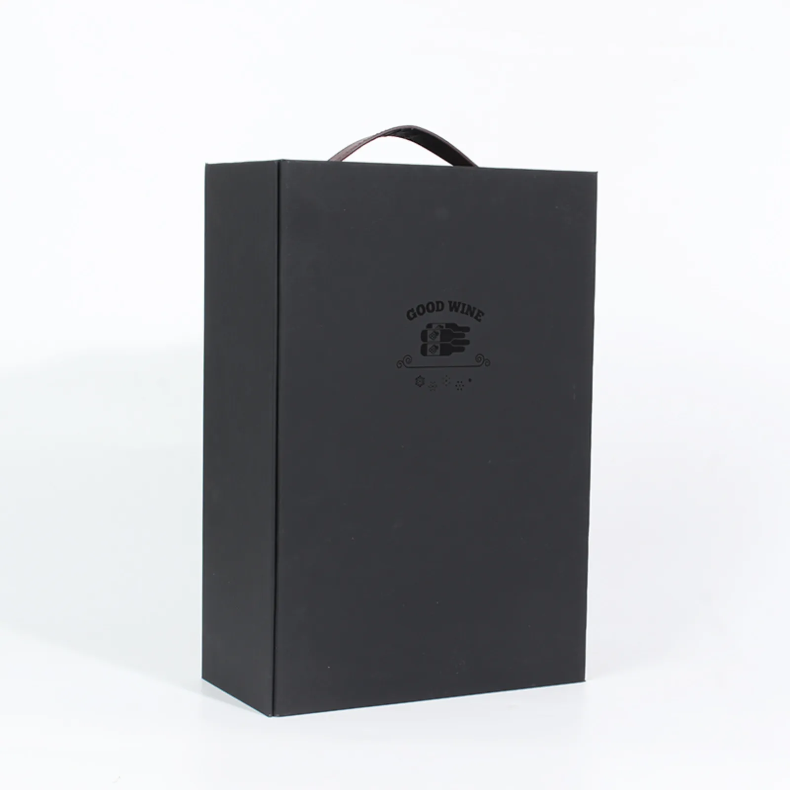
Spot UV is a clear, glossy coating applied to specific areas. You see it on logos, patterns or a single panel. It creates contrast against a matt background. Matt lamination is a film applied over the whole sheet. It kills glare, deepens dark colours and protects the print from scuffing. The combination of matt lamination plus spot UV is common on wine gift boxes. The matt base makes the spot UV pop.
The failure mode: spot UV registration. If the UV layer is off by even half a millimetre, you see a ghost edge around your logo. We hold spot UV registration to plus or minus 1 mm on the insert and plus or minus 2 mm on the box body. That is our control tolerance, not a guarantee. For a small logo, 1 mm is a lot. So we recommend spot UV only on larger elements, or on a full panel where a slight shift is invisible. If your logo is small and intricate, foil or embossing is a better choice.
Colour Control: Pantone, Proofs and the Hard Colours
Pantone matching is how we hold colour. You give us a Pantone reference, we mix the ink to match. Then we print a first article and you approve it before the run. During the run, we pull samples at intervals and check them against the approved sheet. That is mid-run sampling. It is not a guarantee of zero variation. It is a control loop. Ink density shifts with temperature, humidity and press speed. We catch drift before it becomes a rejected batch.
Black, deep blue and burgundy are the hardest colours to hold across a run. They are dark, saturated and show the smallest density change. A 2 percent shift in ink film looks like a different colour on a dark solid. On a light pastel, the same shift is invisible. So if your brand colour is one of those three, approve a wet proof, not just a digital proof. And expect the first article to be the reference, not the Pantone book. The book is a guide. The approved sheet is the contract.
This is where a quality control process matters. Our in-house checks include a 1.2 m six-face drop test with bottle loaded, stacking top load of 40 kg or more for 24 hours, and vibration simulation. But those are structural checks. Colour is checked at the press, not at the end. By the time a box reaches final inspection, the colour is already set. You cannot fix colour after lamination.
Blank Sample vs Printed Sample
A blank sample is the box with no printing. It shows structure, fit, insert and closure. A printed sample shows the artwork, colour and finish. You need both. The blank sample tells you if the bottle fits and the box does not fall apart. The printed sample tells you if the branding looks right. Order them in that order. Structure first, then decoration.
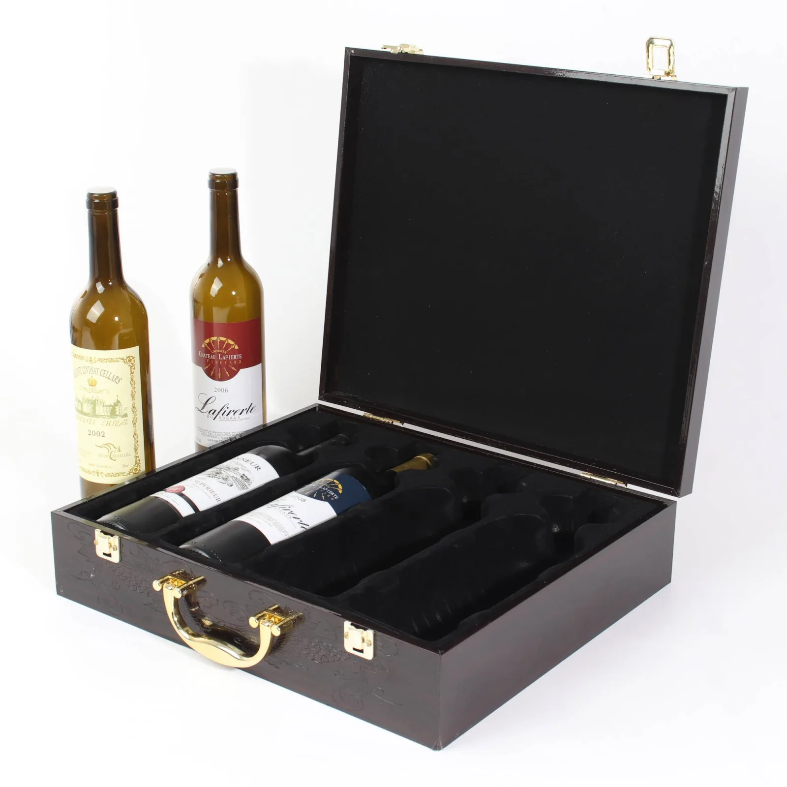
We make blank samples for every new structure. It is the only way to check the insert rule: bottle held at four points, no unsupported neck or shoulder. Shake it for 10 seconds, no movement. Tilt it 45 degrees, no slide. Invert it, no release. That is our insert rule. You can read more in wine gift boxes. Once the blank sample passes, we move to the printed sample. The printed sample is the last checkpoint before mass production. Approve it carefully. That is the box you will get.
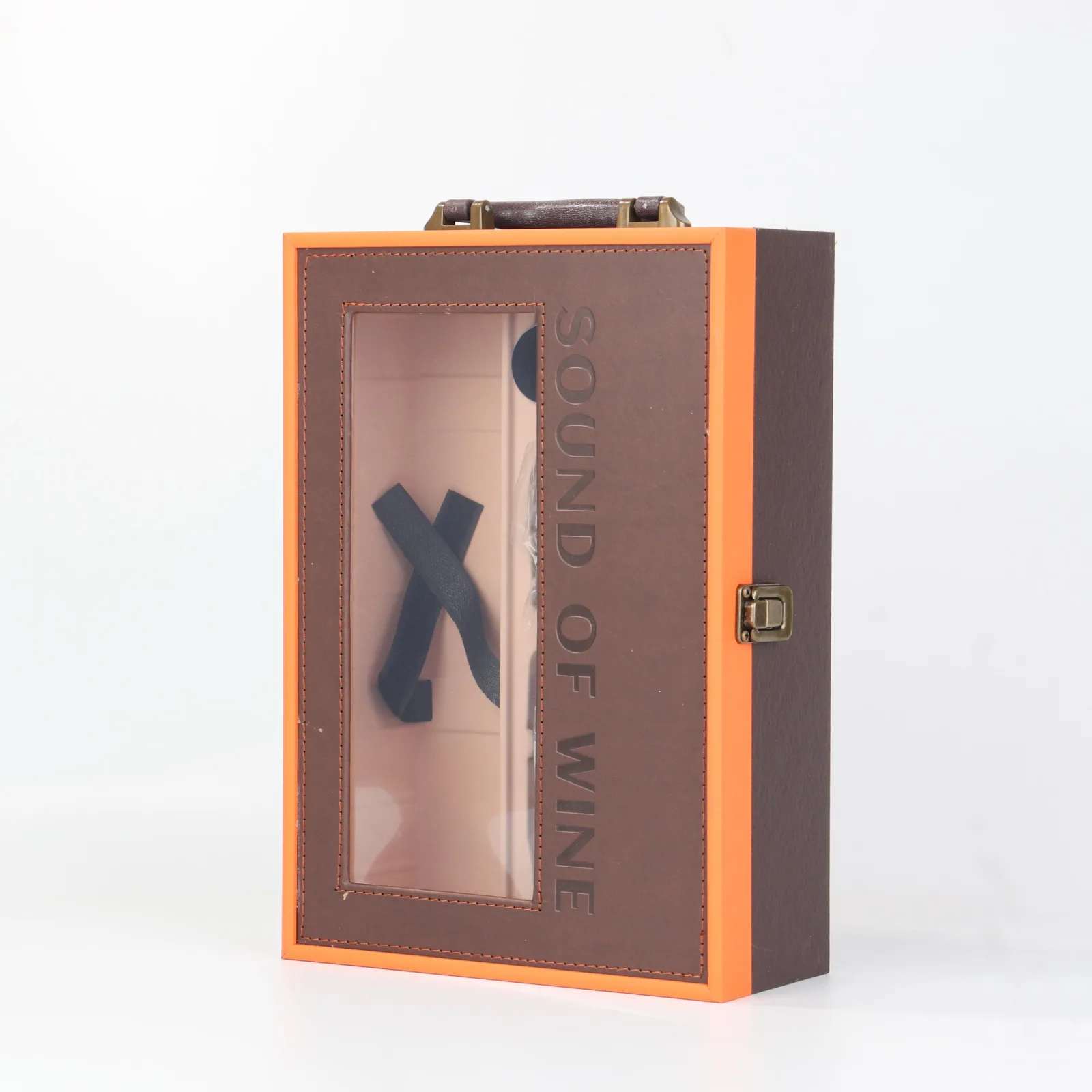
For a leather-look box, the printed sample is even more important. Leather-textured paper takes ink differently than smooth paper. The texture breaks up fine lines and small text. Foil on leather-textured paper is a gamble. We have done it, but the results vary. If you want a leather wine box with foil, expect a proof round just to test the foil transfer. See leather wine boxes for the structures we offer.
What Artwork to Send
Send vector files. AI, EPS or PDF with fonts outlined. For print, use full resolution at final size. For foil and embossing, send a separate layer or file with the areas marked. Do not put foil and print on the same layer. We need to separate them for plate making. For Pantone colours, list the references in the file or in the email. Do not rely on CMYK values to match a Pantone. They will not.
Include the dieline if you have one. If not, send the box dimensions or a bottle sample. We will build the dieline. Mark the glue flap, the fold lines and the safe area. Keep text and logos at least 5 mm from any fold or edge. That is not a hard rule in our specs, but it is good practice. Artwork that runs over a fold will crack or distort when the box is formed.
Finally, send a reference image or a physical sample if you have one. A photo of a box you like helps more than a paragraph of description. We can match structure, paper and finish from a good photo. Not perfectly, but close enough to start the conversation.
Key points
- Pick facing paper first; it decides what print, foil and embossing can do.
- Foil fails on textured paper, use a debossed panel or smoother stock.
- Dark solids like black, deep blue and burgundy are hardest to hold in offset.
- Ask for both a blank sample and a printed sample before mass production.
- Send vector files, separate layers for foil, and Pantone references.
Questions buyers ask
Can I foil stamp on kraft or textured paper?
It will not be clean. Foil needs a smooth surface. On textured paper, the foil only hits the high points and you get a broken line. Use a debossed panel or switch to a smoother specialty paper. Flocked paper is the worst for foil. We will tell you before you pay for a die.
Why do dark colours cost more to print?
They do not always cost more, but they take more control. Black, deep blue and burgundy show density shifts that light colours hide. We run Pantone matching, first-article approval and mid-run sampling. You may need an extra proof round. The ink itself is not more expensive. The attention is.
What is the difference between a blank sample and a printed sample?
A blank sample has no printing. It shows structure, fit and insert. A printed sample shows colour, artwork and finish. You need both. The blank sample proves the box works. The printed sample proves the branding looks right. Approve the blank sample first, then the printed sample.
Send your box dimensions or a bottle sample and we will walk you through the decoration options that fit your budget. Get a Quote
Put this on your bottle
Send the bottle sample or dimensions, quantity and a reference design. We reply with structure options and pricing.
- Email[email protected]